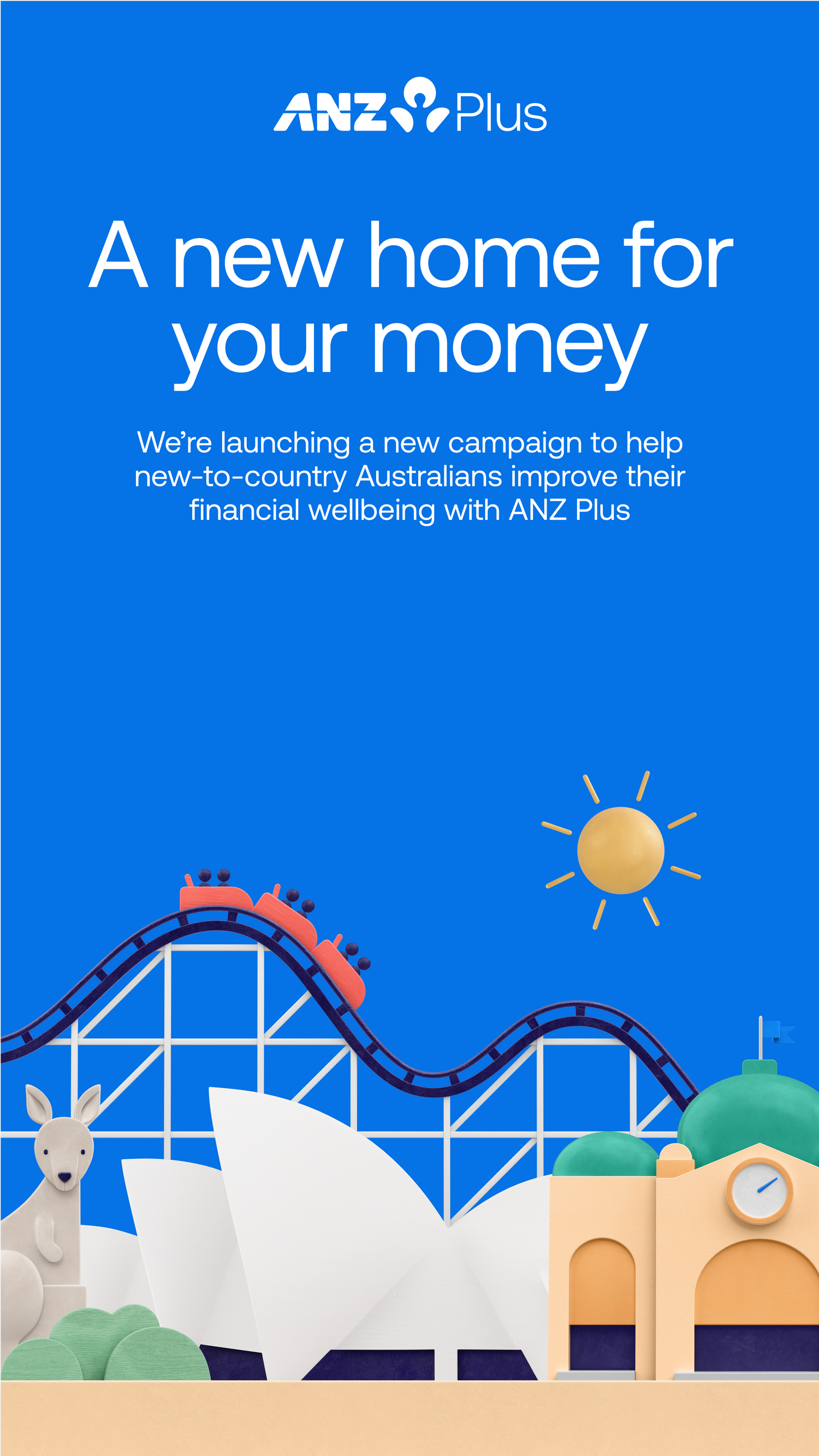
Designing how a million Australians bank.
As Head of Design for ANZ Plus, I built and led the team behind the Plus brand, the app and the system that scaled it, from a blank canvas to a million customers.
Overview
I lead and build design teams that turn ambitious ideas into products people love.
Over 13+ years in digital design and innovation, I've learned that great products come from great teams. At ANZ Plus I built the design & creative function from inception and scaled it to 40+ people, spanning UX/UI, creative & brand, design systems, research, service design and content.
I led the experience end to end, drove a user-centred approach grounded in customer research, and ensured the design vision made its way into the product customers interacted with on a daily basis. What follows is a look at three of the disciplines I led, and the work we produced.
Customers in 24 months, half new to ANZ
In deposits on the platform by 2025
App Store rating across 56,000+ reviews
UI & UX
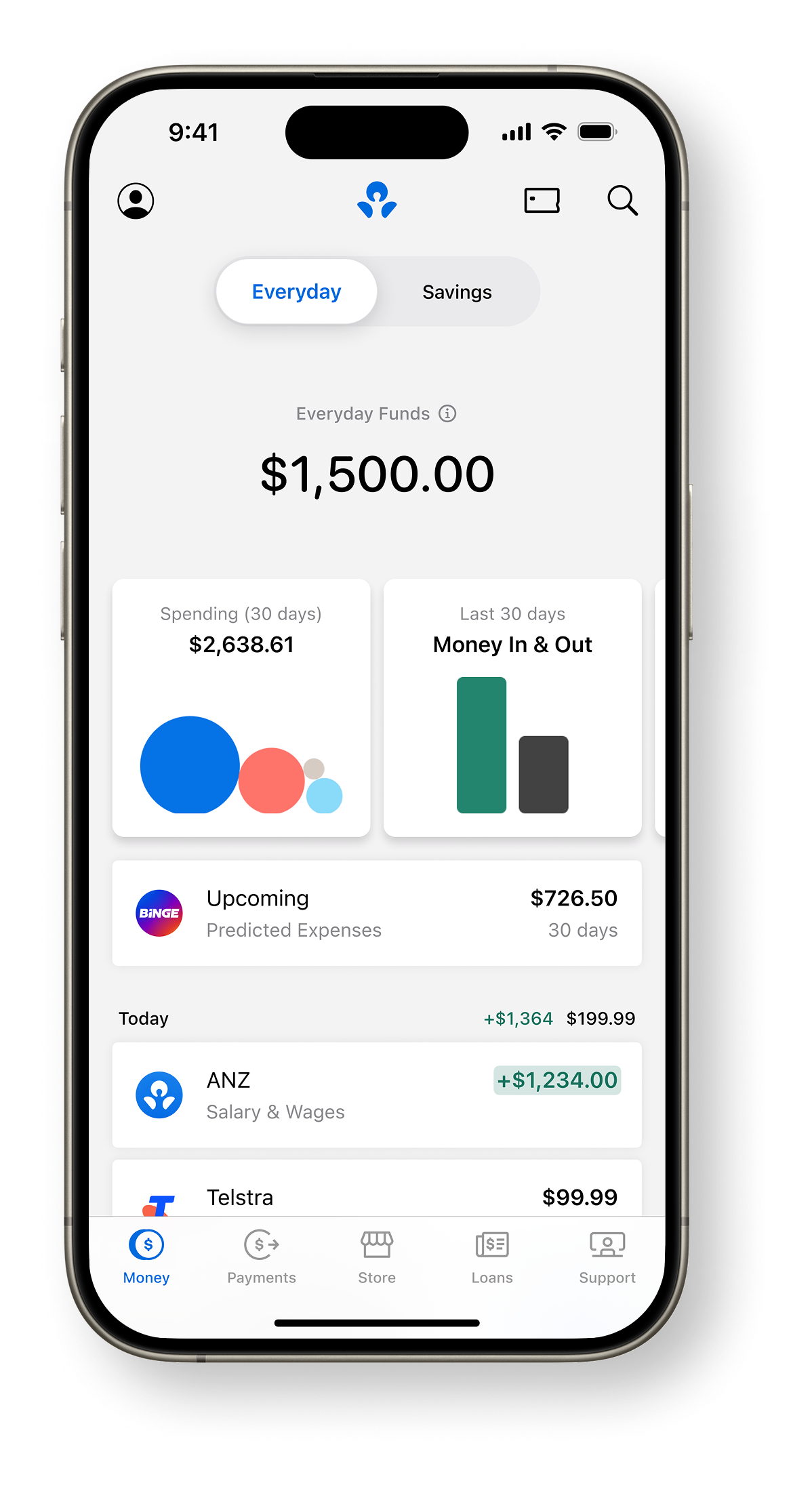
Banking, made effortless.
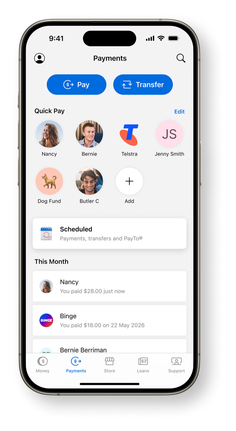
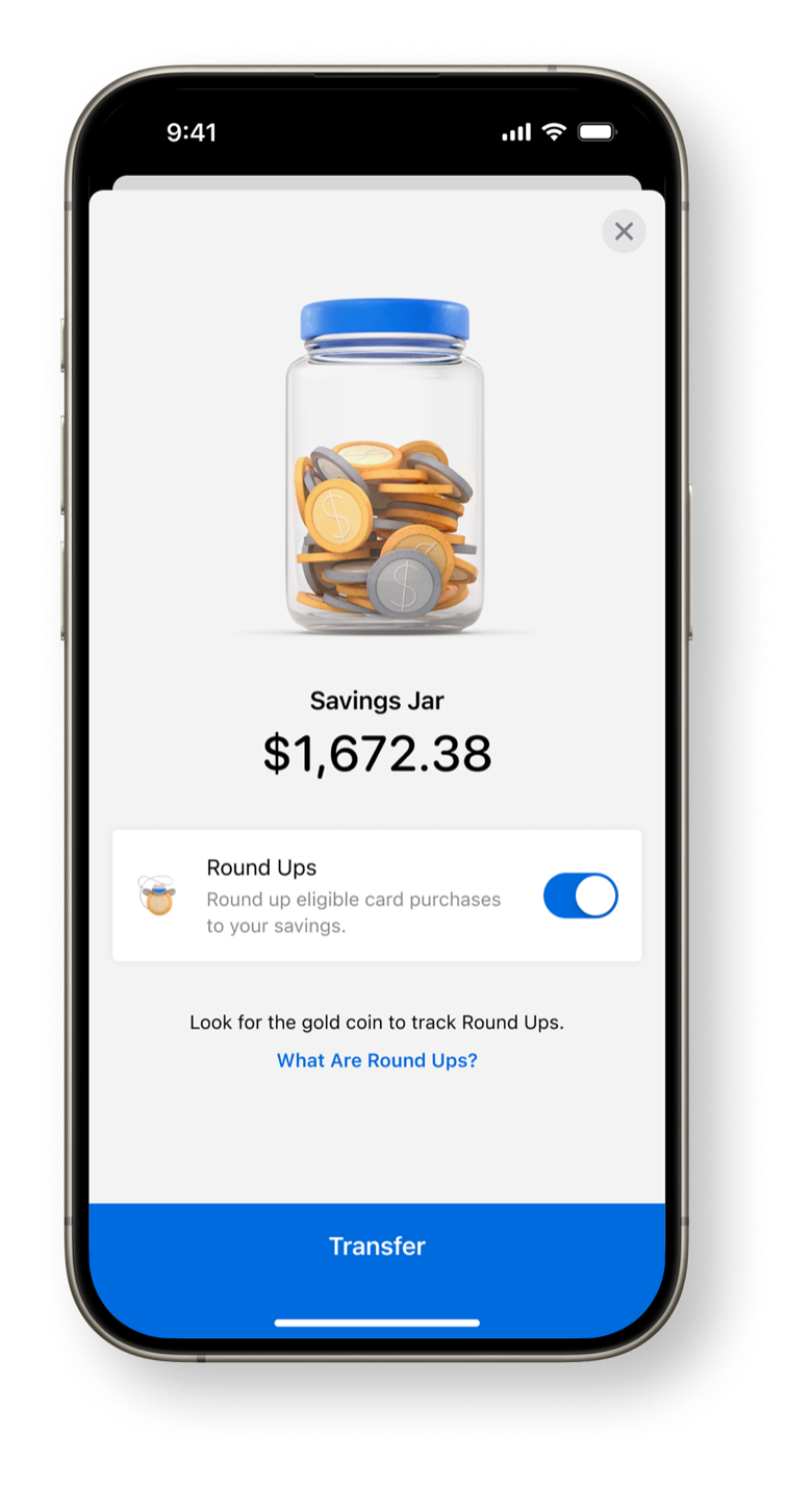
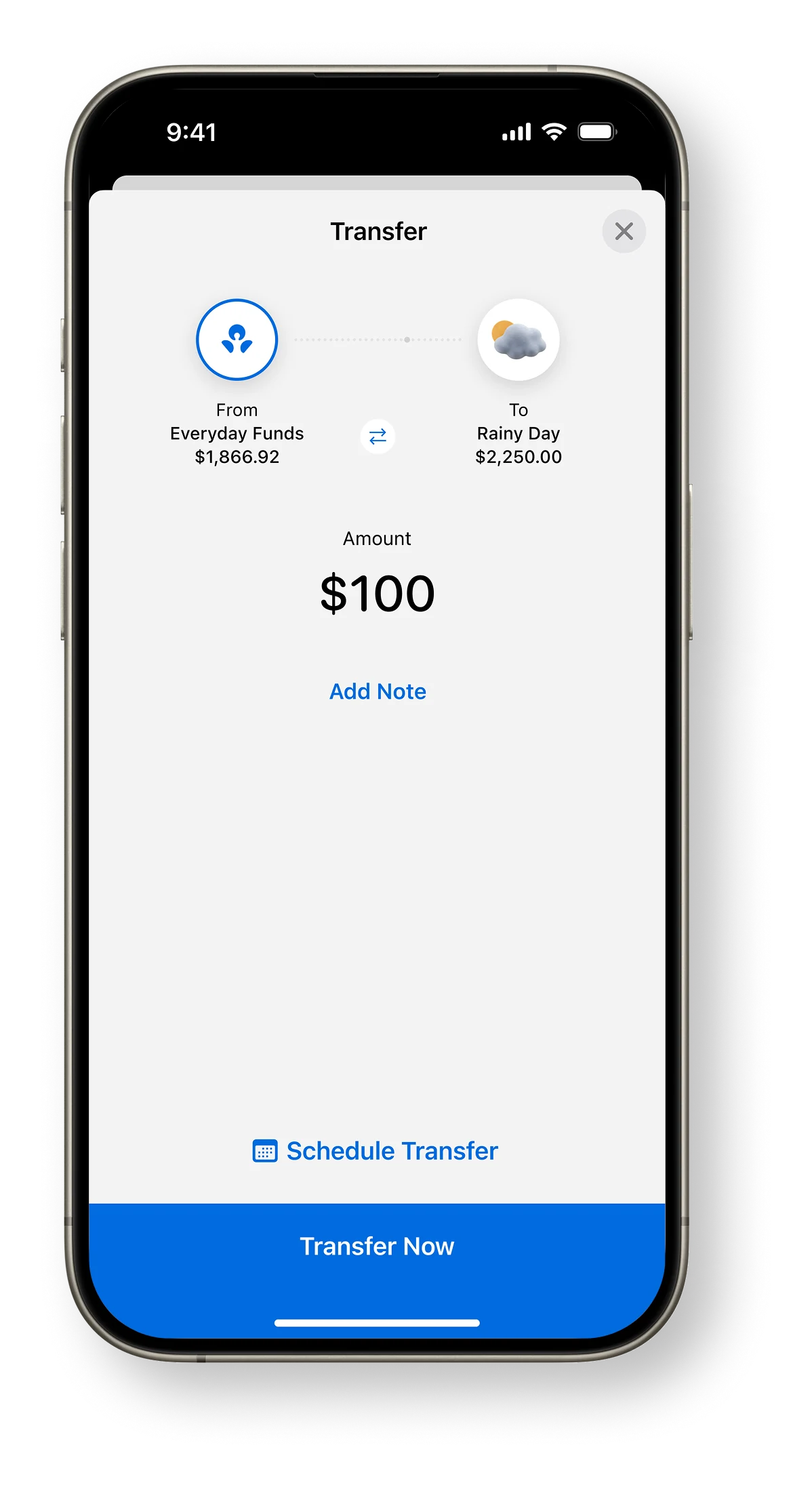
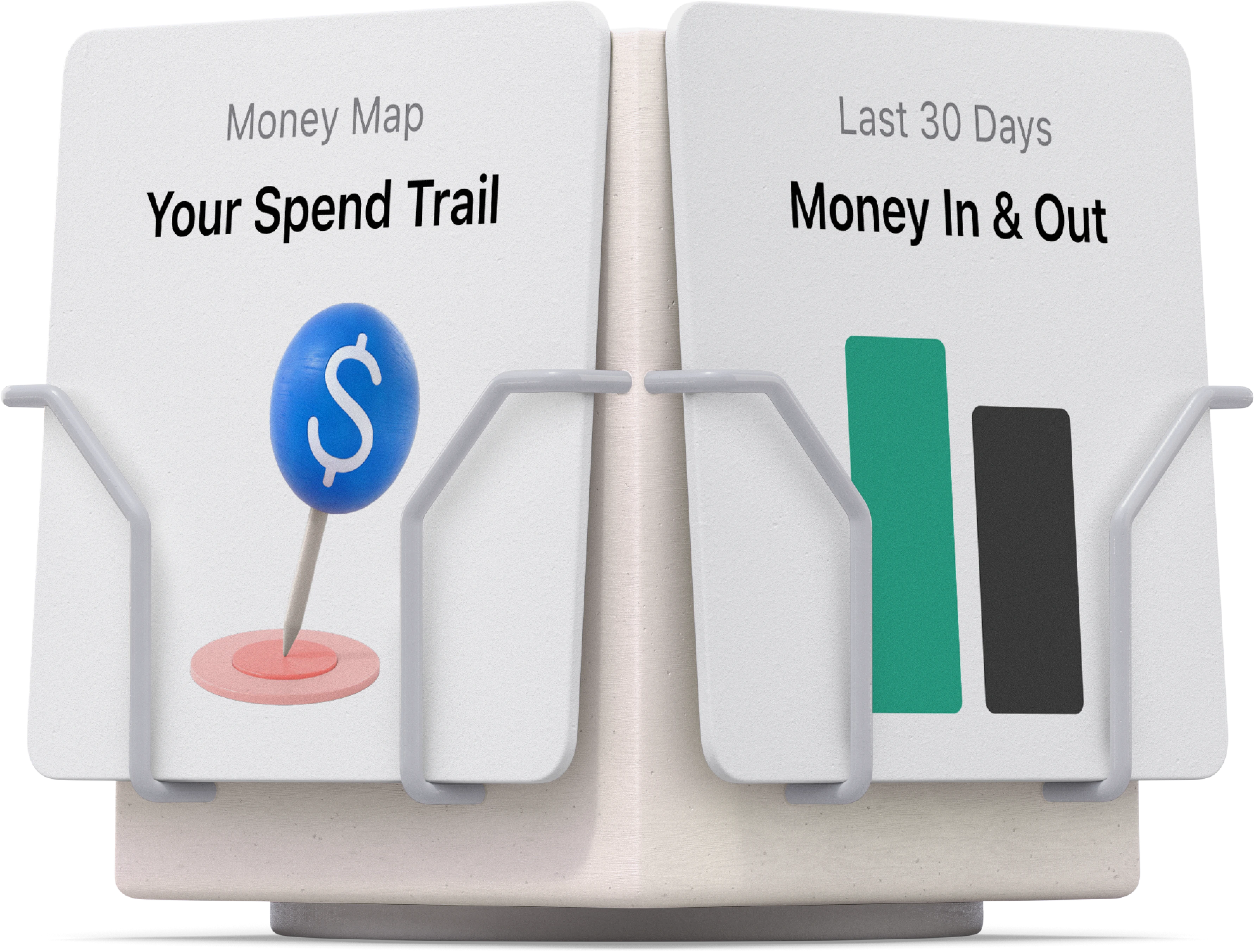
Every core journey (transact, save, pay and spend) rebuilt around clarity. Big, legible numbers; a calm visual hierarchy; and a tab bar that gets out of the way. Nothing on screen that doesn't earn its place.
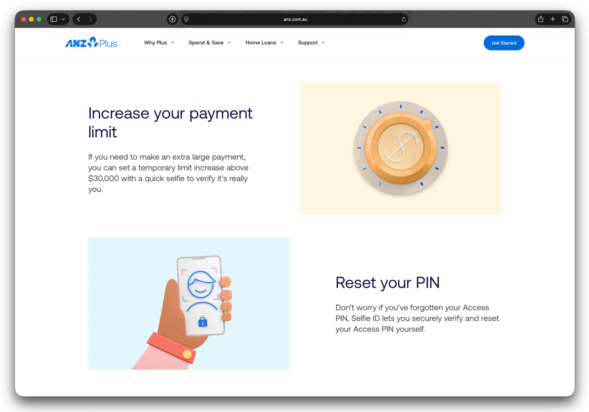
We designed for real life across every touchpoint (mobile, web and physical, not just app screens), mapping each service journey end to end, through to the moments customers connect with a human coach. We tested interactive prototypes with customers on a regular cadence and held a high accessibility bar throughout. The result is an experience that feels simple on the surface but does a lot underneath: fully digital account opening, round-ups and savings goals, in-app product acquisition, and an end-to-end digital home loan.
Of customers actively using wellbeing tools to improve their financial habits
Onboarding improvement through a fully-digital join experience
“Most frictionless consumer iPhone app” (non-major bank), Australian Banking & Finance Awards 2026

Creative & Brand
A heritage brand, reborn digital-first.
We brought 190 years of ANZ heritage into a contemporary, digital-first identity: a warm, confident system of colour, type, 3D illustration and motion that scales from a single app tile to a national campaign. This work was then rolled out as the new ANZ master brand.
Under my leadership, the creative team defined how movement supports the brand, adding warmth and engagement through thoughtful illustration and animation (small moments of charm and playfulness), delivered premium-quality and was woven throughout all touch points of the digital and physical experience.


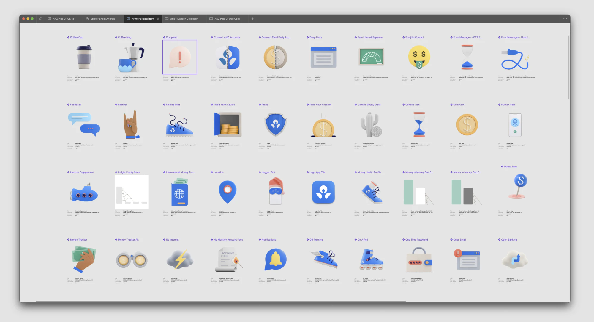
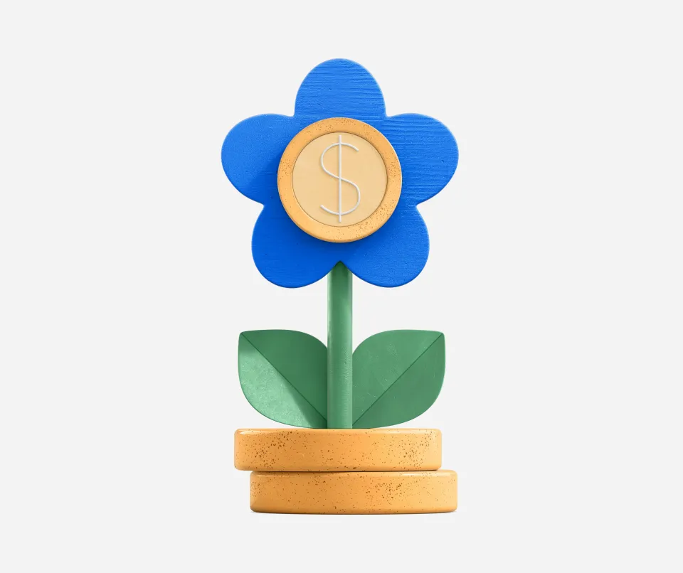
An illustration system, not a set of one-offs.
A library of tactile, 3D-rendered illustrations gave every feature a consistent personality: friendly, optimistic and unmistakably ANZ Plus. One visual language, used everywhere from onboarding to savings goals.
Paired with a motion language that made the product feel alive, it gave the brand its warmth and the wider Plus design, marketing & product teams the ability to bring their products and features to life with cohesive visuals.

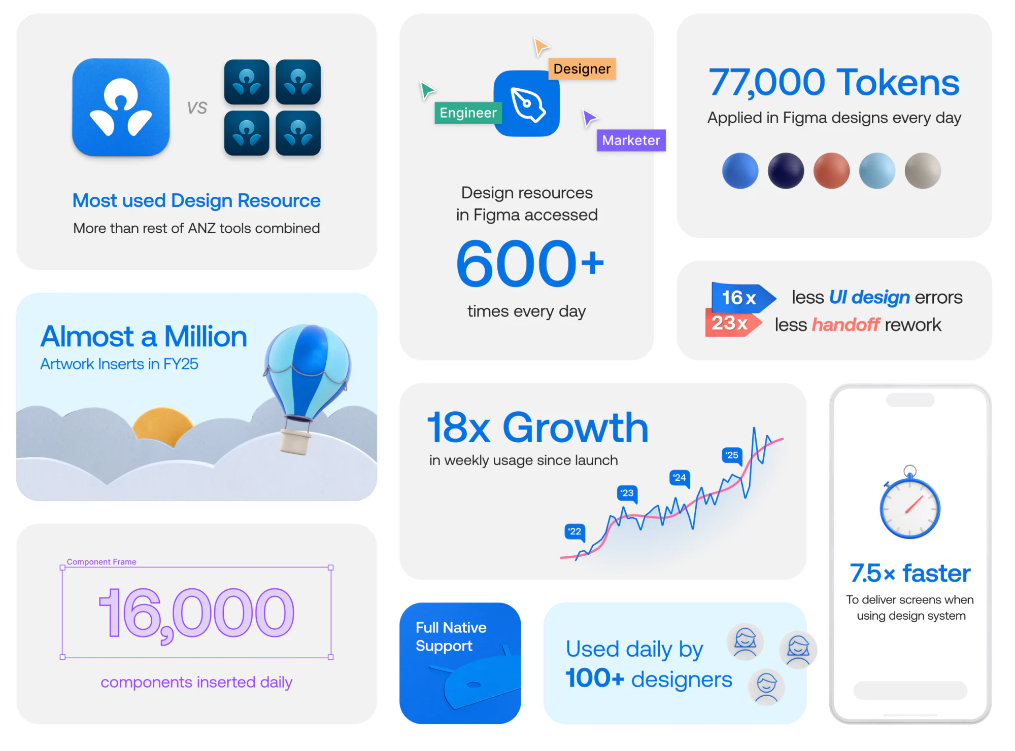
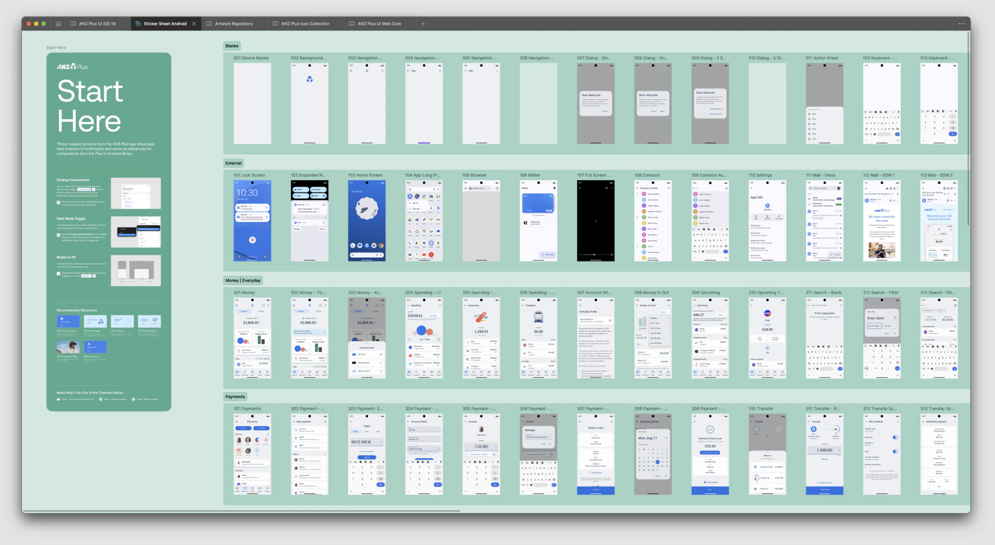
Design System
The system that scaled the whole program.
Brand and product are only as good as the system that holds them together. We built a single source of truth linking design and code across iOS, Android and web: tokens, components, accessibility standards and a shared illustration library.
It turned quality into the default and let every team ship consistent, on-brand experiences at speed. Operationally, it became the backbone of the entire ANZ Plus program, reaching 95% adoption and paying for itself many times over.
System adoption across web & mobile
Hours saved a year, about 23 full-time roles
Return on investment at current adoption